What changes
Coding fonts come with ligatures: -> becomes one arrow, != a crossed-out equals sign, >= a real ≥. Term used to draw every character on its own, so a font's ligatures never showed. Turn them on and they do.
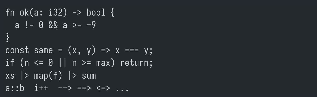
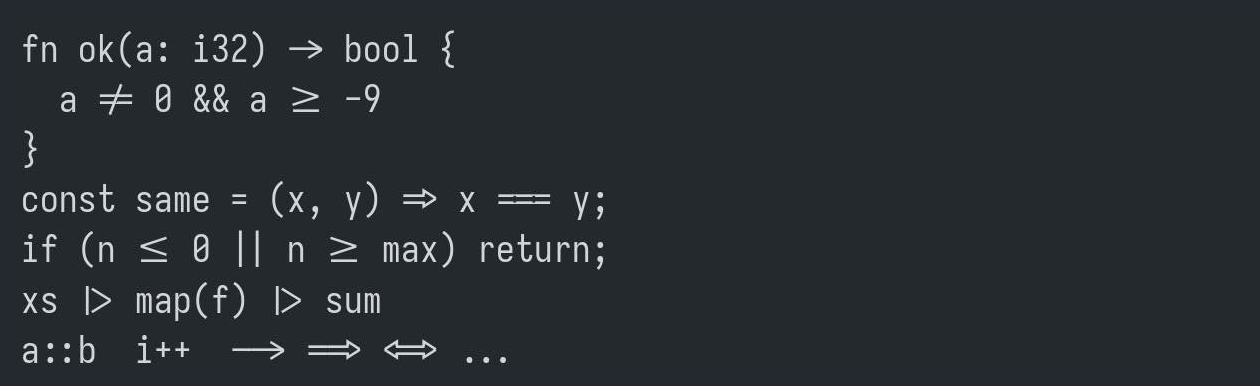
It only changes how the characters are drawn. The text is untouched: -> is still two characters, so the cursor steps over it one character at a time, copying it copies ->, and a program lining up columns sees exactly what it saw before.
Turn it on
Settings → Terminal → Font ligatures. The switch takes effect at once, in every open tab. It is off by default, because plenty of people would rather see the characters they typed.
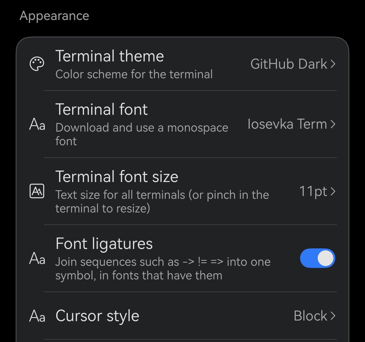
Four fonts in the list have them: Iosevka Term (built in, the default), and JetBrains Mono, Fira Code and Cascadia Code, which download from Terminal font. The others have no ligatures to show, so with the switch on they draw exactly as before. Monaspace Neon keeps its ligatures in optional style sets that Term does not turn on.
Each font draws its own
A ligature is a design, not a rule, so the same line reads differently in each font.
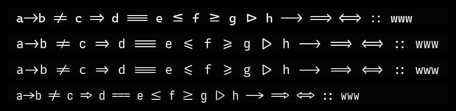
a->b != c => d === e <= f >= g |> h --> ==> <=> :: www. The arrows and bars change with the font; www stays letters (see below).Does it slow anything down
Not in a way you will notice. Term only looks at runs of two or more symbols; ordinary text and ls output skip that step entirely. Each run is worked out once and remembered, so scrolling back over the same code costs nothing extra. In our tests on a phone, a screen scrolling through nothing but operators ran just as smoothly with the switch on as off.
When a ligature comes apart
Some places deliberately show the plain characters.
![A shell prompt with [ "$a" != "$b" ] typed and the cursor on the = sign: != drawn as two characters.](/_astro/cursor-on.DJRHmHfJ.png)

A colour change splits it
When the two halves of an operator are in different colours — a syntax highlighter colouring - and > differently — they stay two characters, so no colour ever bleeds into its neighbour.
Symbols only, not letters
Term joins operators made of punctuation. Ligatures made of letters, such as Fira Code's www and 0x, are left as letters, and so is Monaspace's letter-width “texture healing”.
More on the terminal's fonts: Bold Chinese that stays readable · Text and emoji